Guia da Bolsa – AI immersion case: Inspired by a strategic investment study
Guia da Bolsa – AI immersion case: Inspired by a strategic investment study
This AI immersion case grew directly out of a strategic research project I was conducting for one of Brazil’s largest investment apps (for confidentiality reasons I omit the brand name). In that study, I analysed the behaviour of over 552 000 investors and created a 44‑page framework; the key insight was that beginners weren’t held back by product availability; they were paralysed by fear, complexity and low confidence despite strong product coverage. With those findings fresh in my mind, I took 48 hours to create Guia da Bolsa, an AI‑powered co‑pilot that transforms fear into confidence for first‑time stock investors. Acting as the sole designer and developer, I conducted rapid research, defined the strategy and built a working prototype using a multi‑agent AI architecture.
This AI immersion case grew directly out of a strategic research project I was conducting for one of Brazil’s largest investment apps (for confidentiality reasons I omit the brand name). In that study, I analysed the behaviour of over 552 000 investors and created a 44‑page framework; the key insight was that beginners weren’t held back by product availability; they were paralysed by fear, complexity and low confidence despite strong product coverage. With those findings fresh in my mind, I took 48 hours to create Guia da Bolsa, an AI‑powered co‑pilot that transforms fear into confidence for first‑time stock investors. Acting as the sole designer and developer, I conducted rapid research, defined the strategy and built a working prototype using a multi‑agent AI architecture.

Context & Challenge
Context & Challenge
While leading a strategic repositioning study for a leading investment platform inside a traditional bank, I analyzed 552,000 active investors and delivered a 44-page strategic framework to executive leadership. On that platform, I found a sharp contradiction: it offered around 82% product coverage versus key competitors and an excellent 94/100 Single Usability Metric for the first-investment flow, yet users reported an extremely low satisfaction score driven by crashes during market volatility, slow portfolio loading, missing advanced features for experienced investors, confusing performance views and a painful migration from a legacy broker. When I contrasted this with broader market research on millions of variable-income investors and 32 external studies, it became clear that beginners weren’t failing because of access or product availability, but because of fear of loss, knowledge gaps, platform complexity and lack of trustworthy guidance — a confidence problem more than a feature problem. That insight sparked Guia da Bolsa: an AI co-pilot created as a brand-agnostic case study during a 48-hour immersion at one of Brazil’s largest technology schools, designed as a “mentor, not broker” using multiple agents to translate jargon, contextualize real-time market data and help first-time stock investors make small, confident steps without prescriptive financial advice.
While leading a strategic repositioning study for a leading investment platform inside a traditional bank, I analyzed 552,000 active investors and delivered a 44-page strategic framework to executive leadership. On that platform, I found a sharp contradiction: it offered around 82% product coverage versus key competitors and an excellent 94/100 Single Usability Metric for the first-investment flow, yet users reported an extremely low satisfaction score driven by crashes during market volatility, slow portfolio loading, missing advanced features for experienced investors, confusing performance views and a painful migration from a legacy broker. When I contrasted this with broader market research on millions of variable-income investors and 32 external studies, it became clear that beginners weren’t failing because of access or product availability, but because of fear of loss, knowledge gaps, platform complexity and lack of trustworthy guidance — a confidence problem more than a feature problem. That insight sparked Guia da Bolsa: an AI co-pilot created as a brand-agnostic case study during a 48-hour immersion at one of Brazil’s largest technology schools, designed as a “mentor, not broker” using multiple agents to translate jargon, contextualize real-time market data and help first-time stock investors make small, confident steps without prescriptive financial advice.
How might we help first-time investors move from fear and confusion to small, confident steps in the stock market, in a world where investment platforms feel complex, jargon-heavy and hard to trust?
How might we help first-time investors move from fear and confusion to small, confident steps in the stock market, in a world where investment platforms feel complex, jargon-heavy and hard to trust?
My Role & Setup
My Role & Setup
I worked as the sole product designer across both initiatives: first, leading the strategic repositioning study of a leading investment platform inside a traditional bank, then building the Guia da Bolsa AI co-pilot during an intensive 48-hour AI immersion. In the first project I connected quantitative data (transaction volume, SUM scores, product coverage, PMF signals) with qualitative research (personas, NPS verbatims, Likert comments) to reframe the platform’s strategy. In the second, I designed and coded a functional prototype: an AI mentor that uses real Brazilian market data and Google Gemini to support first-time investors.
Quantitative research – Analyzed 552k+ investors, transaction volume, channel mix, product coverage, Single Usability Metric, and PMF indicators to map where the platform was under-serving beginners.
Qualitative research – Reviewed personas, NPS and Likert comments, help-center patterns and user quotes to understand emotional barriers, frustration points and trust gaps.
Competitive benchmarking – Conducted in-depth benchmarking of 5+ variable-income investment apps to compare journeys, feature sets, language and positioning.
Executive storytelling – Synthesized findings into a 44-page strategic framework and presented recommendations to product, design and technology leadership.
AI immersion & prototyping – Participated in an AI immersion program where I designed the multi-agent architecture, built the chatbot in Python, integrated Yahoo Finance APIs and connected it to Google Gemini.
Narrative & character design – Created the mentor concept, personalities of Navi and Artemis, brand voice and conversation patterns to humanize the AI and make the experience emotionally safe.
Chat experience design & testing – Designed flows, prompts and guardrails, then manually tested and iterated the conversations to balance clarity, empathy, and strict non-advisory behavior.
I worked as the sole product designer across both initiatives: first, leading the strategic repositioning study of a leading investment platform inside a traditional bank, then building the Guia da Bolsa AI co-pilot during an intensive 48-hour AI immersion. In the first project I connected quantitative data (transaction volume, SUM scores, product coverage, PMF signals) with qualitative research (personas, NPS verbatims, Likert comments) to reframe the platform’s strategy. In the second, I designed and coded a functional prototype: an AI mentor that uses real Brazilian market data and Google Gemini to support first-time investors.
→ Quantitative research: Analyzed 552k+ investors, transaction volume, channel mix, product coverage, Single Usability Metric, and PMF indicators to map where the platform was under-serving beginners.
→ Qualitative research: Reviewed personas, NPS and Likert comments, help-center patterns and user quotes to understand emotional barriers, frustration points and trust gaps.
→ Competitive benchmarking: Conducted in-depth benchmarking of 5+ variable-income investment apps to compare journeys, feature sets, language and positioning.
→ Executive storytelling: Synthesized findings into a 44-page strategic framework and presented recommendations to product, design and technology leadership.
→ AI immersion & prototyping: Participated in an AI immersion program where I designed the multi-agent architecture, built the chatbot in Python, integrated Yahoo Finance APIs and connected it to Google Gemini.
→ Narrative & character design: Created the mentor concept, personalities of Navi and Artemis, brand voice and conversation patterns to humanize the AI and make the experience emotionally safe.
→ Chat experience design & testing: Designed flows, prompts and guardrails, then manually tested and iterated the conversations to balance clarity, empathy, and strict non-advisory behavior.
Key findings
Key findings
While investment opportunities have become more accessible globally, psychological barriers remain the primary market blocker. From 32 peer-reviewed sources, three quantified, interconnected barriers emerged that traditional fintech repeatedly fails to address:
While investment opportunities have become more accessible globally, psychological barriers remain the primary market blocker. From 32 peer-reviewed sources, three quantified, interconnected barriers emerged that traditional fintech repeatedly fails to address:
Emotional paralysis (eToro – Retail Investor Beat, 2025)
43% of retail investors across 12 countries cite fear of losing money as their main emotional barrier (eToro, 2025)
55% migrate to conservative options when anxiety peaks.
In Brazil, behavioral studies show beginners often freeze instead of acting, reinforcing a fear, paralysis cycle.
43% of retail investors across 12 countries cite fear of losing money as their main emotional barrier (eToro, 2025)
55% migrate to conservative options when anxiety peaks.
In Brazil, behavioral studies show beginners often freeze instead of acting, reinforcing a fear, paralysis cycle.
Knowledge gaps (TenCap – “Penny Wise, Pound Foolish”, 2024)
51% of people don’t understand investment fees
41% have never considered tax efficiency.
Only 41% feel confident about their financial knowledge
82% want professional guidance but lack access to trusted sources.
51% of people don’t understand investment fees
41% have never considered tax efficiency.
Only 41% feel confident about their financial knowledge
82% want professional guidance but lack access to trusted sources.
Platform complexity (Signicat – “Battle to Onboard”, 2022; ResolvePay, 2025)
68% of users abandon financial app onboarding mid-process, especially when it exceeds 18 minutes or feels more complex than expected, and around
40% drop during registration due to jargon and intimidating interfaces.
68% of users abandon financial app onboarding mid-process, especially when it exceeds 18 minutes or feels more complex than expected, and around
40% drop during registration due to jargon and intimidating interfaces.
The real gap isn’t access to investment products, but emotional readiness and guided understanding, so the solution couldn’t be another trading interface, it had to be a mentor that makes the first steps feel safe.
The real gap isn’t access to investment products, but emotional readiness and guided understanding, so the solution couldn’t be another trading interface, it had to be a mentor that makes the first steps feel safe.
The core principle was simple: educate and support, never prescribe. Every design decision (from routing logic to character design) was tied back to documented emotional states (fear, paralysis, confusion) rather than assuming investor confidence.
Key design decisions
Mentor, not broker (with ethical guardrails)
The assistant is an educational mentor, not a broker: it explains concepts, clarifies scenarios and suggests next questions, but never tells users what to buy or sell. Legal and regulatory constraints are built into its behavior through explicit blocks on recommendations, constant risk reminders and clear ownership of decisions by the user.
Emotion-aware, progressive conversation flow
The flow assumes anxiety from the start. Conversations use no-pressure language, clear ways to pause or step back, and validation that feeling nervous about money is normal. Information is revealed in small, contextual steps instead of all at once, reducing overload and making the dialogue easier to follow.
Evidence-based interaction patterns
Patterns such as when to ask a follow-up, slow down, or surface a disclaimer are tied directly to research on fear, abandonment and trust in financial products. This allowed fast decisions in a 48-hour sprint without guessing: every UX and conversation choice targeted a quantified problem.
Initial conversation logic (v0)

Tools used
Python orchestrator
in Google Colab
Claude Code
Yahoo Finance API /
Brapi.devFigma
N8N
Anthropic Chat Model
Designing the experience
Designing the experience
Color palette: A mix of olive green, muted gold, and soft cream for a sense of clarity, warmth, and balance: more “safe workspace”, less “high-frequency trading floor”.
Color palette: A mix of olive green, muted gold, and soft cream for a sense of clarity, warmth, and balance: more “safe workspace”, less “high-frequency trading floor”.
Typography: Playfair Display for titles: bringing a sense of credibility and editorial seriousness.
Manrope for body text: modern, highly legible and friendly at small sizes
Typography: Playfair Display for titles: bringing a sense of credibility and editorial seriousness.
Manrope for body text: modern, highly legible and friendly at small sizes
Playfair Display 123456
Playfair Display 123456
Manrope 123456
Manrope 123456
Character-driven emotional architecture
To make the experience feel more human and emotionally safe, I created two original characters as strategic UX elements:
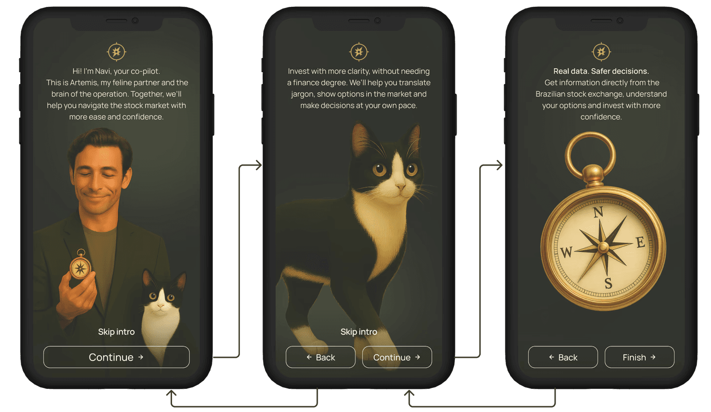
🧭 Navi: The trustworthy co-pilot
Navi is the primary voice of the assistant. He’s designed to feel experienced, calm and approachable and can walk you through it step by step. He connects real market data with simple explanations and checks in emotionally when he senses hesitation.
🐾 Artemis: The analytical cat
Inspired by my real cat, Artemis embodies curiosity and emotional intuition. She appears as a softer presence in the narrative: highlighting reflections, celebrating learning milestones, and reminding the user that it’s okay to go slowly.
Why characters?
They humanize the AI, making conversations feel like guidance, not automation.
They create emotional engagement, so beginners feel accompanied rather than judged.
They help structure information: Navi leads rational explanation; Artemis reinforces emotional safety and curiosity.
They make the product memorable and trustworthy, especially for people who are anxious about money.
Character-driven emotional architecture
To make the experience feel more human and emotionally safe, I created two original characters as strategic UX elements:
🧭 Navi: The trustworthy co-pilot
Navi is the primary voice of the assistant. He’s designed to feel experienced, calm and approachable and can walk you through it step by step. He connects real market data with simple explanations and checks in emotionally when he senses hesitation.
🐾 Artemis: The analytical cat
Inspired by my real cat, Artemis embodies curiosity and emotional intuition. She appears as a softer presence in the narrative: highlighting reflections, celebrating learning milestones, and reminding the user that it’s okay to go slowly.
Why characters?
→ They humanize the AI, making conversations feel like guidance, not automation.
→ They create emotional engagement, so beginners feel accompanied rather than judged.
→ They help structure information: Navi leads rational explanation; Artemis reinforces emotional safety and curiosity.
→ They make the product memorable and trustworthy, especially for people who are anxious about money.


Onboarding flow
A short narrative sequence introduces the assistant, sets expectations (education, not advice) and invites the user to share how they feel about investing before asking anything technical.
Onboarding flow
A short narrative sequence introduces the assistant, sets expectations (education, not advice) and invites the user to share how they feel about investing before asking anything technical.

Agent evolution & trade-offs
I didn’t design the mentor in one shot. It evolved through a series of focused tests: I asked natural questions that matched what I had seen in research – real doubts about goals, timelines, risk and fear – then observed where the assistant broke and redesigned the next version around those gaps.
Early tests exposed a simple truth: without structure and memory, a powerful model behaves like a static FAQ. When I asked clean, isolated questions, the agent did fine. But as soon as I behaved like a real beginner – changing direction mid-conversation or adding a follow-up like “and what if I changed my goal?” – the assistant treated it as a brand-new topic and ignored everything it had “heard” before. That’s how I discovered the limits of a single, keyword-driven agent and the need for both specialization and context retention.
Every new version started from the same loop:
Create a realistic scenario based on the research (e.g., short-term goal, low confidence, fear of loss).
Talk to the agent as a beginner would, without using “magic words” or perfectly structured questions.
Log where it failed – lost context in follow-ups, generic answers, overly technical language, or responses that sounded too close to advice.
Translate failures into design constraints – new rules for routing, memory, tone or safety.
This is how the main trade-offs emerged in practice:
Introducing specialized agents improved answer quality, but testing showed that the system had become rigid: if I didn’t use the expected patterns (“what is…”, “price…”, “how does it work…”), I quickly hit the generic error message.
Adding short-term memory directly responded to what I saw in tests: complementary questions like “and what if I changed the timeframe?” or “would that affect liquidity?” no longer reset the conversation, because the assistant could connect them to the original goal.
Calibrating tone, length and guardrails came from reading the transcripts: some answers were too long, some used jargon beginners wouldn’t know, and some could be misread as recommendations. I iterated prompts and templates until the mentor sounded calm, concise and consistently educational, always reinforcing that decisions belonged to the user.
The visual framework in this section shows how the architecture evolved across versions. This text exists to make one thing explicit: each evolution was a reaction to observed behavior. I used testing not just to “check” the solution, but to decide what the next version of the mentor needed to become.
Agent evolution & trade-offs
I didn’t design the mentor in one shot. It evolved through a series of focused tests: I asked natural questions that matched what I had seen in research, real doubts about goals, timelines, risk and fear, then observed where the assistant broke and redesigned the next version around those gaps.
Early tests exposed a simple truth: without structure and memory, a powerful model behaves like a static FAQ. When I asked clean, isolated questions, the agent did fine. But as soon as I behaved like a real beginner: changing direction mid-conversation or adding a follow-up like “and what if I changed my goal?”, the assistant treated it as a brand-new topic and ignored everything it had “heard” before. That’s how I discovered the limits of a single, keyword-driven agent and the need for both specialization and context retention.
Every new version started from the same loop:
Create a realistic scenario based on the research (e.g., short-term goal, low confidence, fear of loss).
Talk to the agent as a beginner would, without using “magic words” or perfectly structured questions.
Log where it failed – lost context in follow-ups, generic answers, overly technical language, or responses that sounded too close to advice.
Translate failures into design constraints – new rules for routing, memory, tone or safety.
This is how the main trade-offs emerged in practice:
→ Introducing specialized agents improved answer quality, but testing showed that the system had become rigid: if I didn’t use the expected patterns (“what is…”, “price…”, “how does it work…”), I quickly hit the generic error message.
→ Adding short-term memory directly responded to what I saw in tests: complementary questions like “and what if I changed the timeframe?” or “would that affect liquidity?” no longer reset the conversation, because the assistant could connect them to the original goal.
→ Calibrating tone, length and guardrails came from reading the transcripts: some answers were too long, some used jargon beginners wouldn’t know, and some could be misread as recommendations. I iterated prompts and templates until the mentor sounded calm, concise and consistently educational, always reinforcing that decisions belonged to the user.
The visual framework in this section shows how the architecture evolved across versions. This text exists to make one thing explicit: each evolution was a reaction to observed behavior. I used testing not just to “check” the solution, but to decide what the next version of the mentor needed to become.
V1
Single agent
V1
Single agent
V2
Specialized
agents
V2
Specialized
agents
V3
Smart router +
short-term memory
V3
Smart router +
short-term memory
V4
Calibrated mentor
with guardrails
V4
Calibrated mentor
with guardrails
Architecture
Architecture
One generalist agent handling every message, with no routing rules and no context storage.
One generalist agent handling every message, with no routing rules and no context storage.
Three agents (instruction, decision, clarity) chosen only through keyword matching.
Three agents (instruction, decision, clarity) chosen only through keyword matching.
Router combining keyword patterns and intent detection, plus short-term memory for goals, amounts and previous doubts.
Router combining keyword patterns and intent detection, plus short-term memory for goals, amounts and previous doubts.
Same multi-agent + router setup, now wrapped with safety prompts, disclaimers and response-length controls.
Same multi-agent + router setup, now wrapped with safety prompts, disclaimers and response-length controls.
User experience
User experience
Worked only for very “clean”, one-shot questions. Every message was treated as a new conversation.
Worked only for very “clean”, one-shot questions. Every message was treated as a new conversation.
Delivered good answers when users used the expected “magic words” (“what is…”, “price…”, “how does it work…”), but struggled with natural phrasing.
Delivered good answers when users used the expected “magic words” (“what is…”, “price…”, “how does it work…”), but struggled with natural phrasing.
Started to understand follow-up questions, reconnecting explanations to the original scenario instead of restarting from zero.
Started to understand follow-up questions, reconnecting explanations to the original scenario instead of restarting from zero.
Responses became calmer, more concise and educational, always reinforcing autonomy and explaining risks in plain language.
Responses became calmer, more concise and educational, always reinforcing autonomy and explaining risks in plain language.
Main limitation
Main limitation
Any follow-up or ambiguity produced generic or inconsistent answers, breaking trust quickly.
Any follow-up or ambiguity produced generic or inconsistent answers, breaking trust quickly.
When the message didn’t match the keywords, the system frequently fell into a default error like “Sorry, I can’t answer that”.
When the message didn’t match the keywords, the system frequently fell into a default error like “Sorry, I can’t answer that”.
Still missed some edge cases and emotional nuances; needed clearer boundaries for what it could or could not say.
Still missed some edge cases and emotional nuances; needed clearer boundaries for what it could or could not say.
Still a prototype: architecture is solid, but requires real-world validation with investors and compliance teams.
Still a prototype: architecture is solid, but requires real-world validation with investors and compliance teams.

What I learned
What I learned
This project pushed me to connect strategy, research, AI and code in a very short timeframe. A few things fundamentally changed how I design products:
Prioritization through evidence, not instinct
Having more than 30 sources on the table forced me to decide which research-backed problems were truly critical to solve. I learned that when problems are quantified and clearly framed, research accelerates decision-making and keeps the scope honest.AI conversation design
In a conversational product, the flow is the interface. Designing agents that respond to fear, doubt and paralysis made it clear that you can’t “skin” an AI with a UI later, you need a deep understanding of user emotions up front, because every dialogue choice is a strategic decision.Ethical AI isn’t just compliance, it’s positioning
By constraining the assistant to educate, not recommend, I saw how guardrails and transparency can become part of the value proposition in regulated markets. Responsible AI design builds long-term trust and actually differentiates you from more aggressive, opaque solutions.Research as a shortcut for rapid prototyping
Using synthesized insights (instead of starting from a blank page) allowed me to design flows, prompts and guardrails quickly, knowing exactly which fears and failure points I was targeting. Clear evidence let me say “no” to nice-to-have features and focus on the confidence gap.Technical depth expands the design toolkit
Learning how to wire multi-agent logic, real-time market APIs and short-term memory changed how I think about UX. Understanding the backend gave me room to invent patterns like contextual follow-ups and emotional routing, and proved that I can take an AI concept from Figma to a working Python prototype.
This project pushed me to connect strategy, research, AI and code in a very short timeframe. A few things fundamentally changed how I design products:
→ Prioritization through evidence, not instinct
Having more than 30 sources on the table forced me to decide which research-backed problems were truly critical to solve. I learned that when problems are quantified and clearly framed, research accelerates decision-making and keeps the scope honest.
→ AI conversation design
In a conversational product, the flow is the interface. Designing agents that respond to fear, doubt and paralysis made it clear that you can’t “skin” an AI with a UI later – you need a deep understanding of user emotions up front, because every dialogue choice is a strategic decision.
→ Ethical AI isn’t just compliance, it’s positioning
By constraining the assistant to educate, not recommend, I saw how guardrails and transparency can become part of the value proposition in regulated markets. Responsible AI design builds long-term trust and actually differentiates you from more aggressive, opaque solutions.
→ Research as a shortcut for rapid prototyping
Using synthesized insights (instead of starting from a blank page) allowed me to design flows, prompts and guardrails quickly, knowing exactly which fears and failure points I was targeting. Clear evidence let me say “no” to nice-to-have features and focus on the confidence gap.
→ Technical depth expands the design toolkit
Learning how to wire multi-agent logic, real-time market APIs and short-term memory changed how I think about UX. Understanding the backend gave me room to invent patterns like contextual follow-ups and emotional routing, and proved that I can take an AI concept from Figma to a working Python prototype.
Let's work together
Open to the right remote opportunities. If you're building something complex and need a designer who can hold the full picture, let's talk.

Let's work together
I'm currently open to remote design opportunities, whether freelance, contract, or full-time. I help teams build high-impact digital products through a mix of strategy, design, and user research, with a strong focus on usability, clarity, and business alignment.
Ready to explore a project together?